Victor Wu
1 Year Ago
The concept of Mobile First was first popularized by Luke Wroblewski, back in 2011. Wroblewski argued that the mobile web was so important that an organization seeking to establish a web presence should first build a mobile-optimized web site, before moving to the traditional desktop-appropriate version. He focused on the web as a technology platform, and therefore, considered why it was advantageous to design and create mobile websites first.
Today, mobile has continued to grow, beyond just the web. And so in this article, we consider the greater notion of mobile itself as a platform, which includes mobile devices (including 4-inch smartphones, 10-inch tablets, and every form factor in between) and mobile apps residing on such devices. We generalize beyond websites and content distribution/consumption, and discuss applications and services, the real currency of technology today. We consider why designing mobile experiences is a high priority. This is our Mobile First.


Images from Wikipedia.org
Numbers, numbers, numbers
Many things in life you just cannot avoid or escape. Mathematics is one of them. This recent article says that there are presently over 1.2 billion mobile web users worldwide. In the U.S. alone, 25% percent of these mobile web users rarely access the web through traditional desktop means, opting instead for mobile, a jarring statistic, since this country pioneered desktop computing. Mobile apps that run on devices have been downloaded almost 11 billion times. And as for mobile devices themselves, 85% of newly purchased handsets can access the mobile web. “Dumb” phones do not really exist anymore. The underlying message is clear: The world is increasingly becoming mobile, and there is still room for impressive growth.
The world population is 7 billion, yet less than half is on the mobile web. Furthermore, many countries are leapfrogging traditional desktop computing altogether. Laptops are prohibitively expensive for many situations. A smartphone may be the only computing device in some households. And even in countries like the U.S., newer generations of users are touting the “post-PC era”, where their computing paradigm is tap-and-swipe, not click-and-type. So in these cases, you as a technology solutions provider, need to know that your target users (even in enterprise settings), may be more inclined to a mobile experience, and increasingly so. As a system implementer, it only makes sense to cater to the current market, and also to the future market. You want to skate to where the puck will be, so to speak.
Building Up
The author in this article talks about graceful degradation vs. progressive enhancement. System designers are well-versed with graceful degradation. Just this past year, we were developing a web front-end, connecting to a content management system for a client. We delivered a slick image upload interface that incorporated the HTML5 File API, allowing users to see inline previews of images in their browser, even before the file was actually uploaded to the server. It worked great in modern browsers, both on the desktop and in mobile. But alas, like many enterprise clients, they required support for older versions of IE that did not support HTML5, so we had to include code that gracefully degraded for those users. It could not just break. They could upload files just the same, but were not able to enjoy the same great experience. So in sum, graceful degradation is about first designing a great experience in your resource-rich environment, and then gradually reducing the quality of experience afterward as your available resources dwindle.
In mobile, screen real estate is severely constrained. (Large-screen phones and tablets are becoming increasingly more popular, but their screens are still small compared to traditional desktop environments.) And so the graceful degradation strategy is to first create an awesome desktop-optimized website with all the bells and whistles. As you get to smaller screen sizes (tablet, a smartphone, and maybe even down to a feature phone), gradually reduce the features, functionalities, and content, served to the user. At first glance, it makes sense. But given the economics of mobile that we just argued, should we not really consider the reverse? And so this is where progressive enhancement comes into play.
Focus first on designing a great mobile website, optimized for that environment. Force yourself to make the hard decisions of what little but important content to serve. Furthermore, the mobile website will be truly optimized and lean, with just exactly what you need, from a technology perspective. And when you are satisfied with your product, then start considering the desktop design. From there, you build up, adding features that make sense along the way. The end result is that you get both a better mobile experience and a desktop experience.
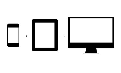
Image from http://designshack.net/articles/css/mobilefirst/, showing Progressive Enhancement
Embracing Diversity
Progressive enhancement is focused on screen real-estate, and thus, is centered on the mobile web aspect, where the primary use is content consumption. It is true that modern mobile HTML5 has many powerful capabilities. But by and large, native mobile apps definitely trump mobile websites in terms of the breadth and depth of functionality. And so this is where designing mobile experiences as a priority really shines. If you focus first on the desktop experience, you inadvertently get bogged down with replicating the same features on mobile. Instead, one should really focus on the diversity of opportunities afforded in a mobile environment. Yes, there are definitely limitations in mobile, screen real estate being the most obvious. But the many opportunities definitely outweigh the limitations. And so when we design the mobile experience first, we can really hone in on, leverage, and exploit these opportunities. We just mention a few in the following.
Mobile experiences are inherently real-time experiences. In a desktop setting, you are chained to that space-time environment. You may be typing an email, sharing photos, or working on a spreadsheet. But all the information that enables you to be productive was garnered previously. In a mobile setting, you can send a text message as the need arises. You can capture, edit, and share a photo or video immediately after you have experienced it yourself. And you can even edit a spreadsheet as you are meeting with an offsite client. The technology adapts to your needs, and not the reverse.
Furthermore, these real-time experiences are physical. You are aided by GPS location coordinates that translate into useful services, like mapping and transportation. These are practical, real-world benefits. A very recent example is the new M7 coprocessor in Apple’s latest flagship smartphone offering. The chip is dedicated to collecting motion data from the accelerometer, gyroscope, and compass, making it available to on-board native apps. This dedicated system is optimized for this singular purpose, saving valuable battery life in a mobile setting.
And so we see a plethora of opportunities for mobile. Compared to desktop computing, mobile computing is still nascent. We encourage you to consider the Mobile First strategy in your technology systems, and welcome the amazing business opportunities it brings.

