How Responsive Web Design Works
The driving force behind responsive web design is the ability to use browser properties to determine the correct display for the website's layout and content. For example, a tablet user would see a resized version of the desktop layout, compressed to fit the space, and a smartphone user would see a one column layout with an expanding navigation.
One strategy for optimizing website layouts with responsive web design is to use breakpoints. Many devices fall into one of four standard device widths:
- 960 pixels – Desktop devices
- 720 pixels – Tablets in portrait mode
- 480 pixels – Smartphones in landscape mode
- 320 pixels – Smartphones in portrait mode
These widths can be used as breakpoints for our website design. For example, if the browser width is greater than or equal to 960 pixels, we could use a 920 pixel width, three column layout. If our browser width is 480 pixels or less, we'll change our site width to 480 pixels and a one column layout.
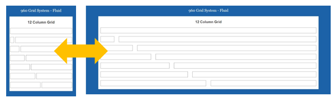
Responsive design can be taken to another level using fluid, percentage-based layouts. Fluid layouts allow your website to fill the browser, regardless of the width. Other elements, like images, videos and text can also be made fluid so that your content fits the layout, no matter the size. Then through testing we set the breakpoints for layout and content changes where they are needed, rather than at standard sizes. This guarantees that every user (not just the "standard" set) have a great user experience. However it does require more testing to make sure the site and content respond well at every size.
Using CSS styling instead of images when possible
The release of CSS3 provided designers and developers with a variety of styling options previously accomplished using hacks and images. Things like drop shadows, rounded corners and gradients are now achievable with a single line of code, allowing us to keep our designs small and fast-loading. Occasionally, some CSS3 styles may not render correctly in older browsers, and in these cases, fallback options are available
Navigation
Navigation is one of the most important factors to consider when designing a responsive website. A multi-level site must be as easy to navigate from your desktop (using a wide screen monitor and a mouse) as it is from a smartphone (using a very small touch screen). A standard drop-down navigation menu generally works best for desktop, but when using touch-based devices with smaller screens, this method causes issues.
As a general rule, content takes precedent over navigation on mobile. Too many mobile experiences start with a list of navigation options instead of content. Studies show that most people will scroll on a site, but the most important information should usually be toward the top of a page.
It's also easy for a site to look confusing if all the pages look the same. One example is this site, where because the header and navigation take up so much room, it's not immediately obvious that the web pages are different.
Making a Site Visit Easy for Mobile Users
Besides layout, content and navigation, there are other considerations to take into account when designing a responsive website:
Buttons and Touch-based Interactions
Buttons, links and other such elements should be easy to select with a finger tap. The general rule is to make them the size of a fingertip (the people at Apple define this as 57 pixels square). There must also be adequate space left around the element, so nearby items won't be selected accidently.
Content Strategy
When working with existing sites to make them responsive, we use a top down method – optimizing the content as we shrink it down in size. Starting with your desktop-friendly website, we will modify the layout and content so the site will display and function well on mobile devices.
As we scale from a large desktop to a small device, content typically changes in one of three ways:
- It shifts: As the screen gets smaller, columns become narrower. Sidebars and other secondary content blocks move from the side to below the main column(s). Rows of six images become three, and then two, and then one, etc. All of this is done so you don't have to pinch, expand, and move around a site on a smaller device.
The flow of content, though, still needs to make sense to visitors as a screen sizes shrink. Interdigitation is the weaving of content in a way that keeps the most important information easily available. A product summary that, on a desktop device, floats on the right side of the page gets pushed under a main photo so users still get information quickly. A large navigation, on smaller pages, may be pushed to the bottom of a page.
- It's hidden: Content that would otherwise take too long to skim by scrolling or just doesn't fit well in the layout can be hidden. One way to keep important information easily accessible is to make some content expand when visitors want to view it.
In addition to keeping price information and the "add to cart" link at the top, reviews are visible only by expanding the reviews section. This prevents the most important links – the ones that allow visitors to buy products – from being buried by secondary information.
- It's removed: Generally, this is avoided. Ideally every user should be able to access all site features, regardless of the devices they use. On some sites users lose the ability to post jobs, find prices, and learn about the website when they use a tablet or mobile device. This puts the site at a disadvantage because most mobile users expect to be able to do as many things as a desktop user. Therefore, it is important not to hide important content as a screen size gets smaller.
However, in the name of aesthetics, reduced scrolling, lowered page load time, etc. some content can be hidden on smaller devices. If the decision to remove content is made, it should be backed by solid evidence proving it's the best decision.
desktop tablet and mobile devices
When working on new projects, a Mobile First method is preferred. It means the default presentation and base content is mobile, optimized for the simplest devices first. Then we "progressively enhance" the website as it moves up in size. Using this strategy we can provide mobile users with minimal screen real estate, processing power and third party plugins an amazing experience that both looks great and functions perfectly. As the need arises, the site can gradually be enhanced and even completely rethought for larger platforms with fewer constraints.

